GOOGLE: PIXEL 2
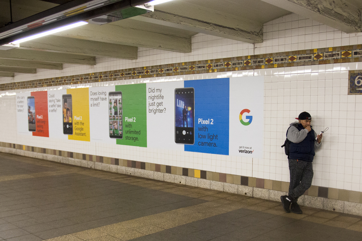
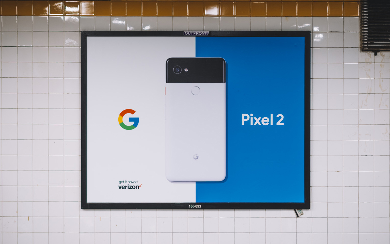
Design rules supreme when working with Google. To launch Google’s Pixel 2, it was our job to ensure that all design worked in harmony with elements both within the frame and the surrounding environment. I worked alongside a team of brilliant creatives to craft print, OOH, and DOOH assets for the campaign
Google thinks your phone should make your life easier - and straightforward communication was the name of the game when crafting the visual language for Google’s Pixel 2. We based Pixel 2’s design system on a call and response: Google puts forward a common problem and Pixel 2 provides a solution. Graphically, our OOH poses questions to the audience, while the other half of the design answers. We wanted our OOH to reflect the phone’s friendly life-hack nature through easy-to-read bold type, bright friendly “googley” colors, and perfectly proportioned ratios that create a sense of ease. The campaign celebrates inquisitive minds, utilitarian thinking, and the brilliance of simplicity.
** Please note: OOH images represent units in Chicago and San Fransisco. Photos by Jake Tieman and Eli Hochberg
Agency // Droga5
Client // Google
Creatives / Juliana Gutowski, Eli Hochber, Kathryn Brylinsky, Jake Tieman
Design Director / Michael Kleinman